First things first: I wish you all a very happy New Year 2025!
Obviously I wouldn't write a post just for that, so here goes. As someone who occasionally travels for work and sometimes for pleasure, I rely quite heavily on the real-time information.
By far my favourite way to travel is for obvious reasons by train, and here in Germany at least, it's easy to find the information you need when you need it. Websites like bahn.expert by the brilliant marudor, for example, provide departure information for all stations using the most reliable data sources available. The information is easy to access and I am usually done checking it before I have even found the right menu option on the official Deutsche Bahn website.
Unfortunately, flying (which is still necessary from time to time) is a different story. There are third-party websites that provide aggregated departure information, but relevant details are often coming through with a delay or missing altogether. So I tend to use the websites (or sometimes apps) provided by each airline or airport. The information is usually accurate, but oh boy, are the design choices frustrating.
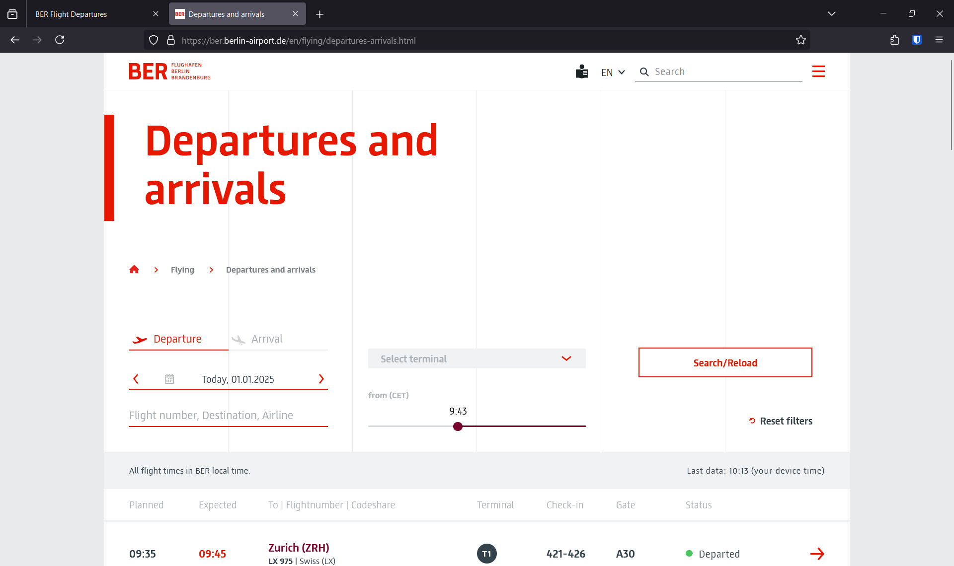
Take Berlin airport as an example. I am using a Windows laptop with a screen resolution of 1920x1200 (and a scale of 125%) and I can only see a single departure on the official website:

The search box duplicates the search functionality found in any browser. The departure time slider duplicates the scrolling functionality (you can scroll down to see later flights, there is no advantage to using the slider).
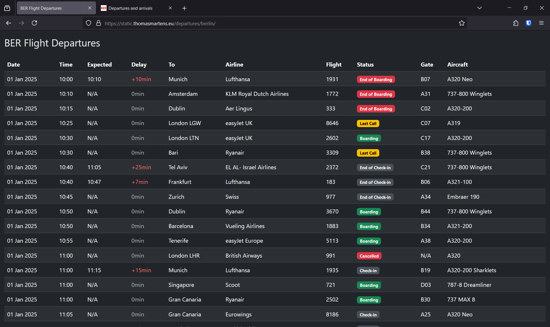
No BER bashing intended, it's just my local airport. Many other airport websites are similarly designed. I (not a designer, not a developer) have tried to build an alternative UI and can comfortably fit 17 departures (1,600% more flights if you will) into the same browser window:

I've been using this for a while now, and I can't think of a scenario where I'd rather have access to the UI filtering options, which block almost the entire space on the official site.
I understand that there are trade-offs between design and functionality. I just wish us users didn't have to further search for the information we want once we've found the right site using somewhat redundant UI elements on overview pages.
To end my rambling on a more positive note: The official website has deep links to individual flights, which a user can bookmark once they found the right flight (for example). It's pretty neat, and the design choices made by the BER team work much better for these pages, I think.
Well, thanks for reading and I hope you enjoy 2025! If the frequency of my past posts is any indicator, I'll be writing again next year 🙈

